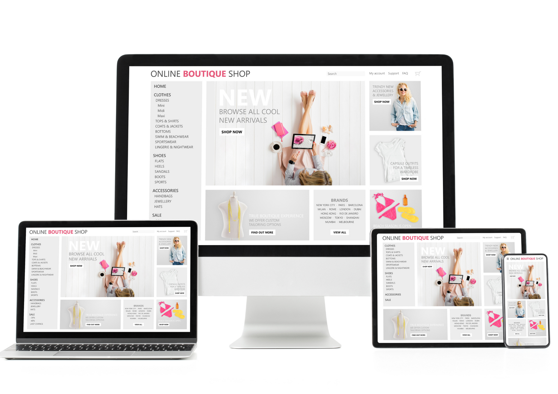
Mobile browsing now plays a central role in how customers interact with businesses online. For homeware brands, health and wellness businesses, and retail companies, a significant proportion of visitors will access websites via smartphones or tablets. If navigation feels awkward or confusing on smaller screens, users are likely to leave before engaging further.
Effective website design takes mobile behaviour into account from the outset. Easy navigation is not just about fitting content onto a smaller screen; it is about simplifying journeys, reducing friction, and ensuring visitors can find what they need quickly and confidently.
This article outlines five principles for creating intuitive, mobile-friendly navigation.
Prioritising Simplicity in Mobile Navigation
Mobile screens naturally limit how much information can be displayed at once. As a result, simplicity becomes essential. Navigation menus should focus on the most important pages rather than trying to replicate a full desktop experience.
Clear menu labels, logical grouping of pages, and minimal layers of navigation help users move through a site without frustration. Overly complex menus or excessive dropdowns can feel cumbersome on touchscreens and increase the likelihood of users abandoning the site.
A simplified structure also improves performance by reducing load times and making interactions feel more responsive. For businesses working with a website designer near me, this means visitors can reach key information quickly, supporting better engagement and stronger outcomes.
Designing for Thumb-Friendly Interaction
Mobile navigation must account for how people physically use their devices, which is a key consideration in effective website design. Most users browse with one hand, relying heavily on their thumb, so navigation elements placed too close together or positioned awkwardly can lead to accidental taps and poor usability.
Menus, buttons, and links should be sized appropriately and spaced clearly. Important actions are often best placed within easy reach at the bottom or centre of the screen, rather than tucked into hard-to-reach corners.
This principle applies across industries. Retail businesses benefit from easily accessible product categories, while health and wellness brands can improve trust by making contact or booking options simple to reach. Thoughtful placement supports smoother journeys and reduces user effort.
Maintaining Clarity Across Pages and Sections
Consistency plays a major role in mobile navigation. Users should always know where they are within the site and how to move back or forward. Clear indicators such as highlighted menu items, breadcrumbs, or simple back options help maintain orientation.
Content should also be broken into manageable sections. Long pages can work well on mobile if they are structured clearly, using headings and spacing to guide scrolling. This approach prevents users from feeling overwhelmed and encourages continued exploration.
Businesses that work with a website design company often benefit from this disciplined approach, as it ensures that navigation remains intuitive even as content grows or changes over time.
Supporting Performance and Accessibility on Mobile
Mobile navigation must perform reliably under varying conditions. Users may be browsing on slower connections or older devices, making optimisation essential. Lightweight menus, efficient code, and streamlined assets all contribute to smoother navigation.
Accessibility is equally important. Navigation should be usable by people with different needs, including those relying on screen readers or alternative input methods. Clear contrast, readable text, and logical structure improve usability for everyone.
While some businesses explore tools and platforms when researching best website builders, the underlying principles of performance and accessibility remain consistent. A mobile-friendly site should feel responsive, inclusive, and dependable regardless of how it is built.
Planning Navigation for Long-Term Growth
Mobile navigation should not only meet current needs but also allow for future expansion. As businesses grow, they may add new services, product ranges, or content sections. A flexible navigation structure makes these additions easier without disrupting existing user journeys.
Scalable planning avoids the need for frequent redesigns and helps maintain consistency as the site evolves. This is particularly valuable for growing retail brands or service-based businesses that expect to expand their offerings.
Well-planned web page design considers how navigation will adapt over time, ensuring the website remains easy to use as both content and audience expectations change.
ETA Web Design focuses on creating mobile-friendly websites that balance usability, performance, and long-term flexibility. We understand that navigation plays a critical role in how users experience a website, especially on mobile devices.
Our approach combines careful planning with practical website design principles to deliver scalable solutions that support business growth across any location or sector. By prioritising clarity and user experience, we help businesses create websites that are easy to navigate, professional in appearance, and built to deliver consistent results.
Latest post on X: Improving mobile navigation through smarter
website design!


